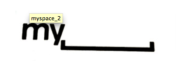
MySpace Rebrand
MySpace is attempting to breathe some new life into its site by changing the logo.
At the best of times changing a logo is a hit and miss affair, but MySpace certainly seem to be heading for a miss with this one.
Original Logo
New Logo
5 Points
Respond to this post & discuss why this is a good or bad logo redesign.


I don’t like the new logo. The old logo wasn’t great but it was simple and highly recognizable. It was a very practical logo. The new logo requires you to know what the company’s name is before seeing the logo. Without knowing the company’s name a person who sees the new logo for the first time might read, “my blank”. The new logo also leaves it’s self open for people to fill in the blank space with there own word. My foot, my butt, my whatever. It’s a mistake and I think myspace should go back to the old logo.
It’s a really interesting choice. I personally think their current branding is too similar to Facebook, which has outgrown them in popularity. I think in order for them to recapture their audience, they need to make some seriously edgy changes to get attention.
I’m going to say that I agree with the new logo. It’s fun, interesting, and very original. Myspace will probably make some other edgy changes to re-attract their lost users, and upon revisiting the site their old followers will get a chuckle out of the new logo. They must have considered that people might not be able to discern the brand by reading the logo, so they will most likely include the full name in other aspects of their branding. In any case, they need to make a BIG change before people completely forget the name, my______…
I agree with Nick in that their logo is very similar to Facebook’s, however, the name “myspace” is so original there are a multitude of possibilities when designing a logo, and frankly, the one they are considering now falls very short of my expectations.
At first, I thought it was a joke. I actually had to look at it 3 times before I could figure out what it was. It’s too complicated, their logo needs to be something people can look at, recognize, and remember. This in no way does any of that, at least for me.
Not only was it hard for me to decipher, once I did, I found it repulsively “random”. I think that nowadays, random is good, and usually funny. But in this case, I think myspace went WAY overboard. I’m praying they’re not serious about this option.
I think, when considering the new logo outside the realm of the social networking context, its a fence sitter. The ala sepia look adds that “vintage & valuable” accent, and is a positive embellishment to the site. The odd combination of type and organic characters definitely stimulates interest, but whether or not it accurately represents Myspace isnt definitive in my mind.
In my mind, a logo should, or at least aim to, encapsulate what the company, service, or product stands for. If the logo is symbolic or cryptic, it should be so in a manner that it avoids detracting from the essence of the company.
I like the playfulness of the typography and the angular work. I dont, however, like the weakened opacity of the overall palette. The softer look doesn’t coalesce with the concept of a “comeback” in the social scene, and I think that they should have used a deeper more contrasted palette.
We’ll see soon if Myspace becomes the next best thing…..Again.
I find this far too ambivalent and vague to possibly get my approval, although, I do see the possibilities that come with this simplicity. It is the typographical equivalent of a blank canvas, and could be turned into anything they wish to promote at the moment. Similar to the way MTV created space in which to place the artists they wish to promote.
In complete honesty, this logo initially reminded me of an idea I might have had while brainstorming and immediately discarded. While it is true that MySpace and Facebook have similar logos, it is also true that MySpace did it first and in order to show innovation should be the first to embrace the idea of updating their brand. It is remarkable how dated and out of the loop the former design and especially the characters within it appear, considering that the company has not yet reached it’s decade mark.
I applaud the company’s motivation to give MySpace a face-lift. I do, however, think that poor choices were made and that they should have sought a second opinion.
Cant say im a big fan, while i do agree that the company needs a redesign of both logo and perception in oder to stay relevant. I think this current version fails to be as clever as it pretends to be.
As a gimmick it might help remind some of their lost users what myspace was about, but how well will it do to attract new users?
I think it tries too hard to be witty and misses the mark.
It took a second at the beginning of the presentation to catch on to what MySpace is trying to do which is establishing a logo that is universal in a way that each user can make it fit their personality (or so what I thought), however, the images in the end seem to loose that message and ended up confusing the audience (which is why no one applauded). MySpace needs a new marketing strategy not a new logo if it wants to compete with facebook. Logo recognition is not the problem, everyone know what MySpace is and if they decide go to in the direction using the last images in the presentation they will most likely lose more clients.
Steve Harris